Global colour authority Pantone has this week named its 15-5519 Turquoise as Color of the Year for 2010.
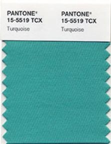
Pantone says that turquoise is a colour that most people respond to positively, having appeal for both men and women, and which translates easily to interiors and fashion.
With both warm and cool undertones, it pairs well with any other colour in the spectrum, adding a splash of excitement to neutrals and browns, complementing reds and pinks, creating a classic maritime look with deep blues and livening up other greens, and is especially trend-setting with yellow-greens.
“In many cultures, turquoise occupies a very special position in the world of colour,” according to Leatrice Eiseman, executive director of the Pantone Color Institute. “It is believed to be a protective talisman, a colour of deep compassion and healing, and a colour of faith and truth, inspired by water and sky.
“Through years of colour word-association studies, we also find that turquoise represents an escape to many – taking them to a tropical paradise that is pleasant and inviting, even if only a fantasy.”