 Paint brand Dulux Heart Wood has unveiled Heart Wood as its Colour of the Year for 2018.
Sitting between a smoky taupe and dusky mauve, Heart Wood is described as a ‘warm neutral, with a hint of heath’.
Dulux explained: ‘We’ve identified a global need for homes to feel even more nurturing than before – and this is where Heart Wood comes in.’
The Colour of the Year is selected annually to help consumers make colour and design choices with more confidence. 2018 marks the 15th year of the development of the Colour of the Year, based on the analysis of social, economic and design trends by the colour team at Dulux’s Global Aesthetics Centre, together with a group of 11 international independent experts. Their research revealed a strong trend of consumers wanting to transform their homes into spaces of retreat from the outside world.
“As life gets faster, now is the time to press pause,” said Heleen Van Gent, creative director of the Global Aesthetic Centre. “Our home needs to be a place where we can turn down the noise, where we can nurture our values and recharge. Colour can play a significant role in addressing the balance between outside clamour and inner calm.
“Our 2018 Colour of the Year truly captures the mood of the moment. Heart Wood and its complementary palettes will help consumers achieve a home that is truly and uniquely theirs, bringing a feeling of safety and reassurance, creating a welcome home for all.”
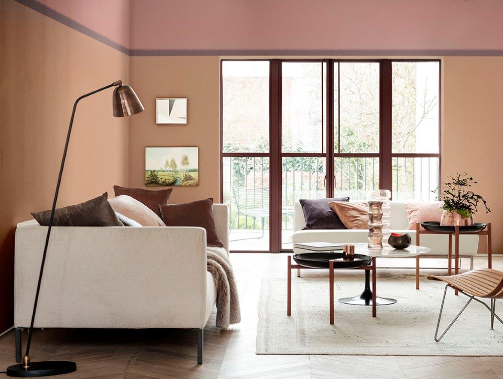
‘A Welcome Home’ is the theme of the Heart Wood. Combining gentle shades of grey-pink, blues and soft cocoa, flowing into bolder shades of ink blue and purple, it takes inspiration from the tactile qualities of natural wood and the comfort of leather.
“These are materials convey comfort and ease in response to consumers wanting to nestle down more and create ‘a welcome home’,” Dulux said. “But because ‘a welcome home’ means different things for different people, three supporting palettes complement Heart Wood, balancing softer shades with deeper, bolder tones.”
The Comforting Home palette features warm earth tones, bringing together clay and blush pink tones to calm the mind, soothe the senses and shut out the noise.
The Inviting Home palette brings comfort and convenience to life. Cool shades of blue encourage a clear-headed approach, while neutrals and fresh green support the need for connection with the outside world. Softer pastel shades are enhanced by coal and ink blue.
The Playful Home creates a space to be inspired and invigorate the senses. Yellow-toned green and gold encourage a creative approach to life, while pops of colour add a sense of fun and energy.